 Talk to Sales
 Benchmarks
View scores and output across OCR models spanning many document categories.
Want to run these evals on your own documents?
Talk to Sales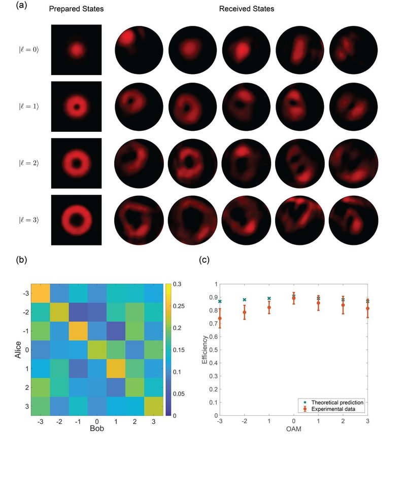

(a) Prepared States and Received States.
Four rows of intensity profiles are shown, corresponding to OAM states , , , and . Each row displays the prepared state (left column) and five examples of received states (right columns) resulting from the interaction.

(b)
A heatmap showing the joint probability distribution of OAM states between Alice (y-axis, values -3 to 3) and Bob (x-axis, values -3 to 3). The color scale ranges from 0 (dark color) to 0.3 (yellow).

(c)
A plot of Efficiency (y-axis) versus OAM (x-axis, values -3 to 3). The graph compares Theoretical prediction (marked with 'x') and Experimental data (marked with circles and error bars). Theoretical predictions are consistently higher than experimental data.